UX/UI Design
How to Design Toasts and Alerts
Feedback is where most products go quiet. Toasts, alerts and banners each answer a different question, and mixing them up is why users miss errors. This guide covers anatomy, types, placement, timing, choosing the right one and the Figma setup.
Muhammad Saud Musaddiq4 min read
Anatomy
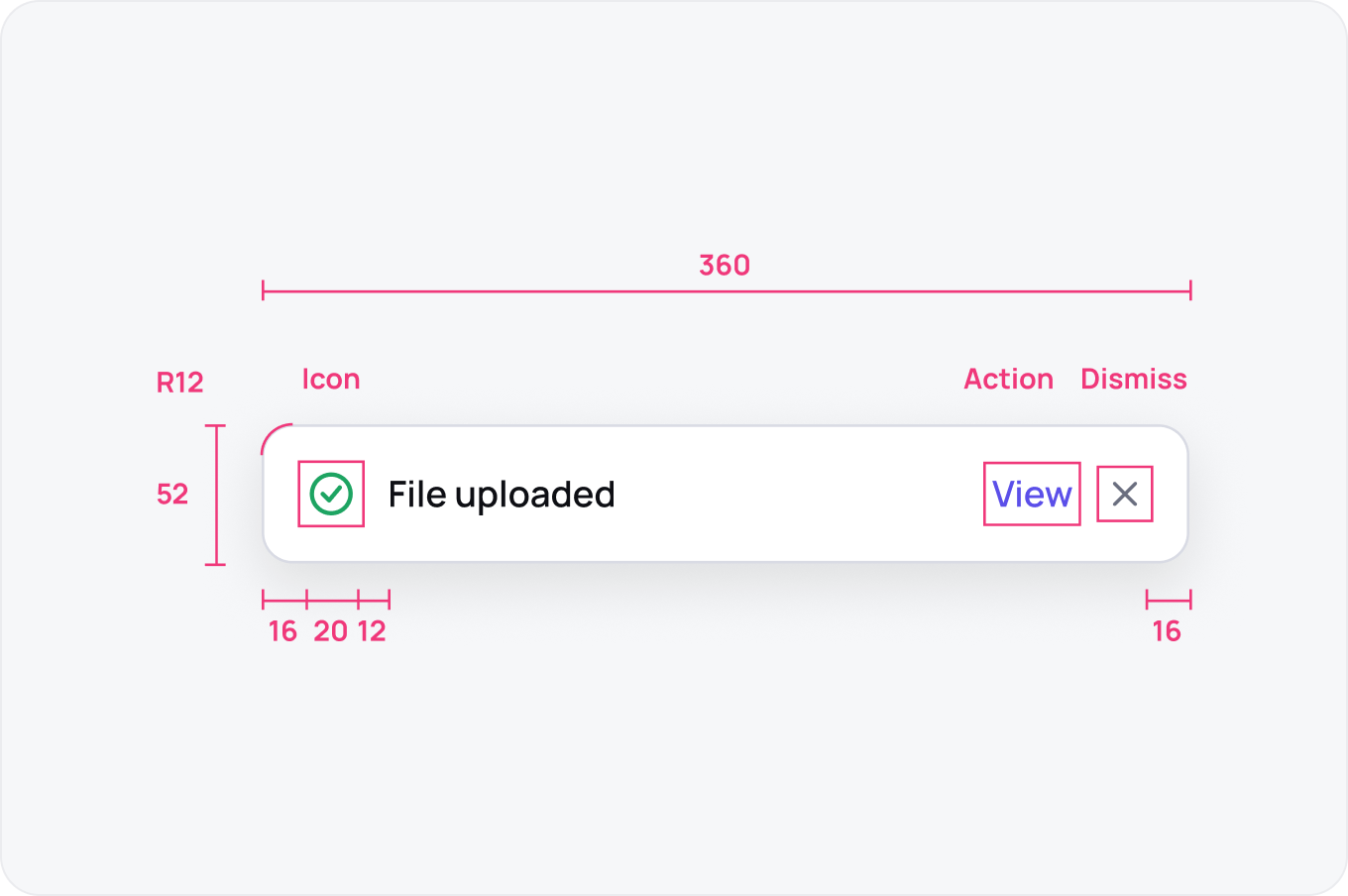
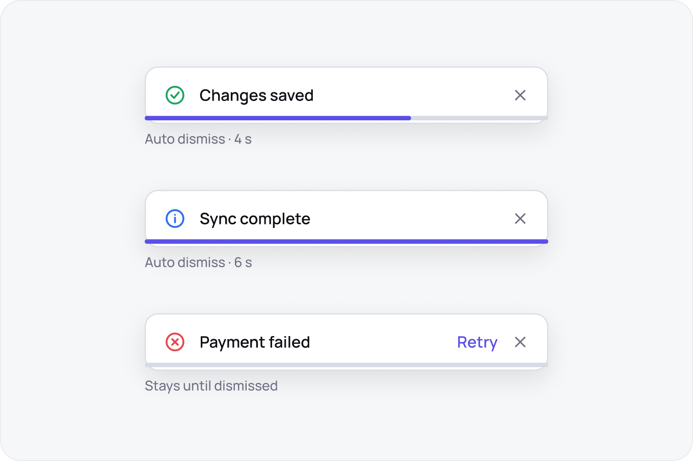
A toast is an icon, a one line message, an optional action and a dismiss control. Keep it to one sentence, 360 wide, padding 16 and radius 12.
Types
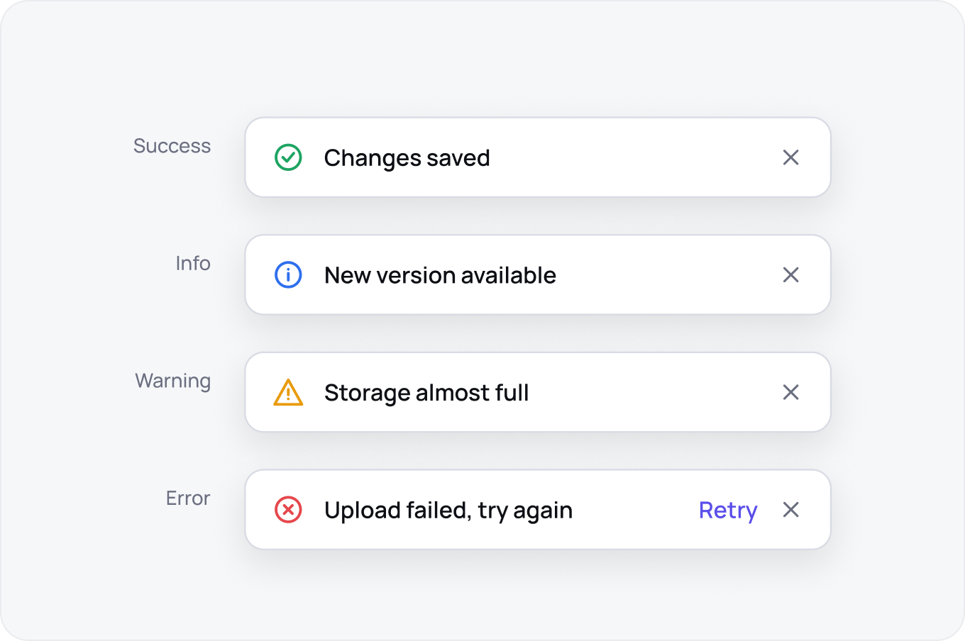
Four types are enough: success, info, warning and error. Colour carries the type, the icon repeats it for colour blind users and the message says what happened in plain words.
Placement
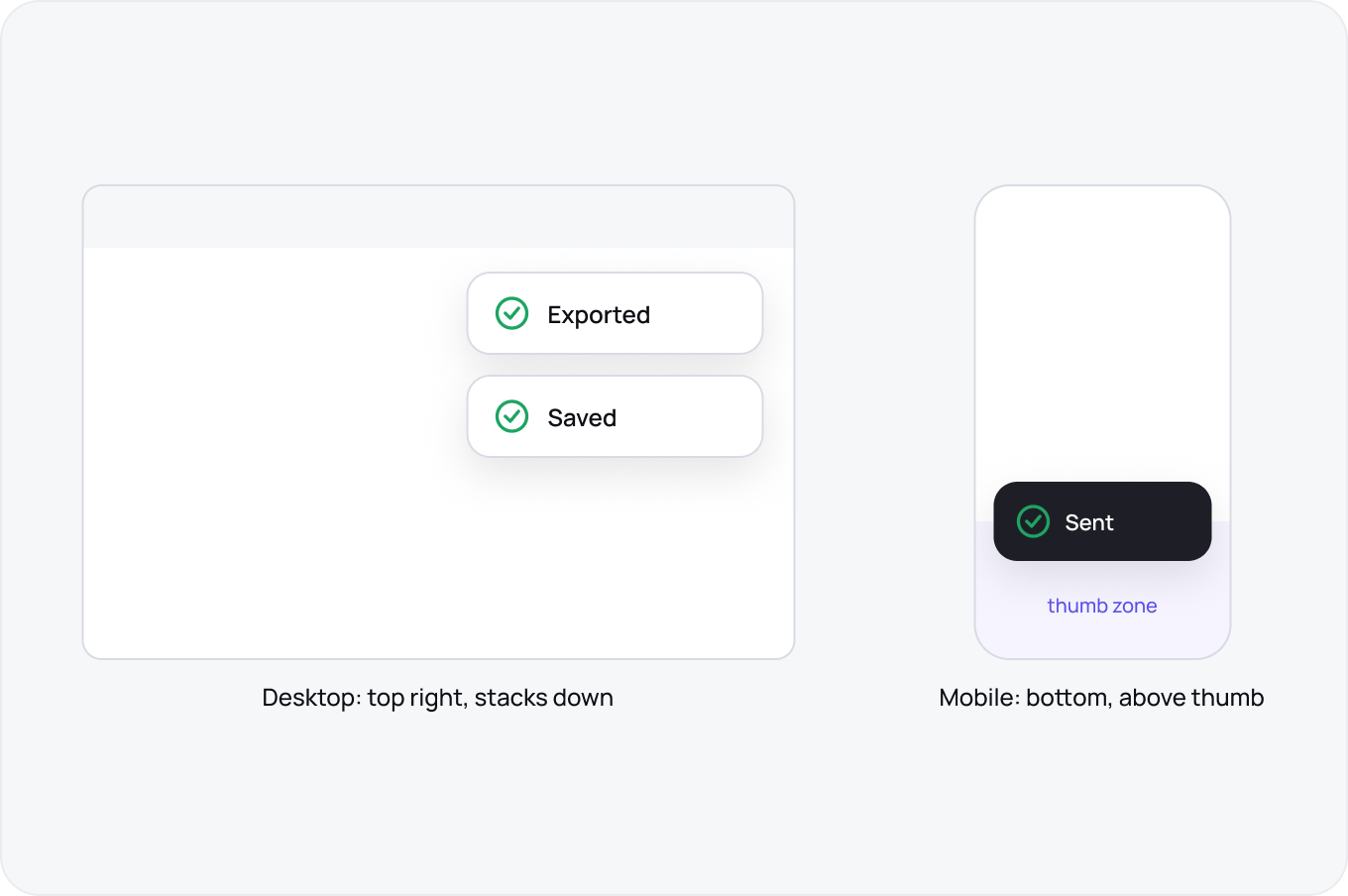
Top right on desktop, bottom centre on mobile above the thumb zone. Never cover the control the user just pressed.
Timing
Auto dismiss after 4 to 6 seconds for success and info. Errors and anything with an action stay until dismissed.
Toast, Alert or Banner
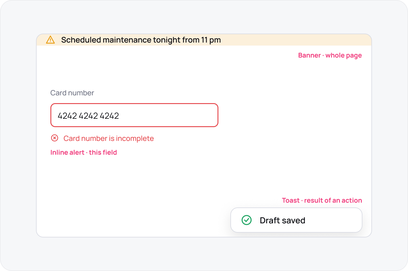
Toast for a result of something the user did, inline alert for a problem in the form they are filling, banner for a state that affects the whole page.
Properties in Figma
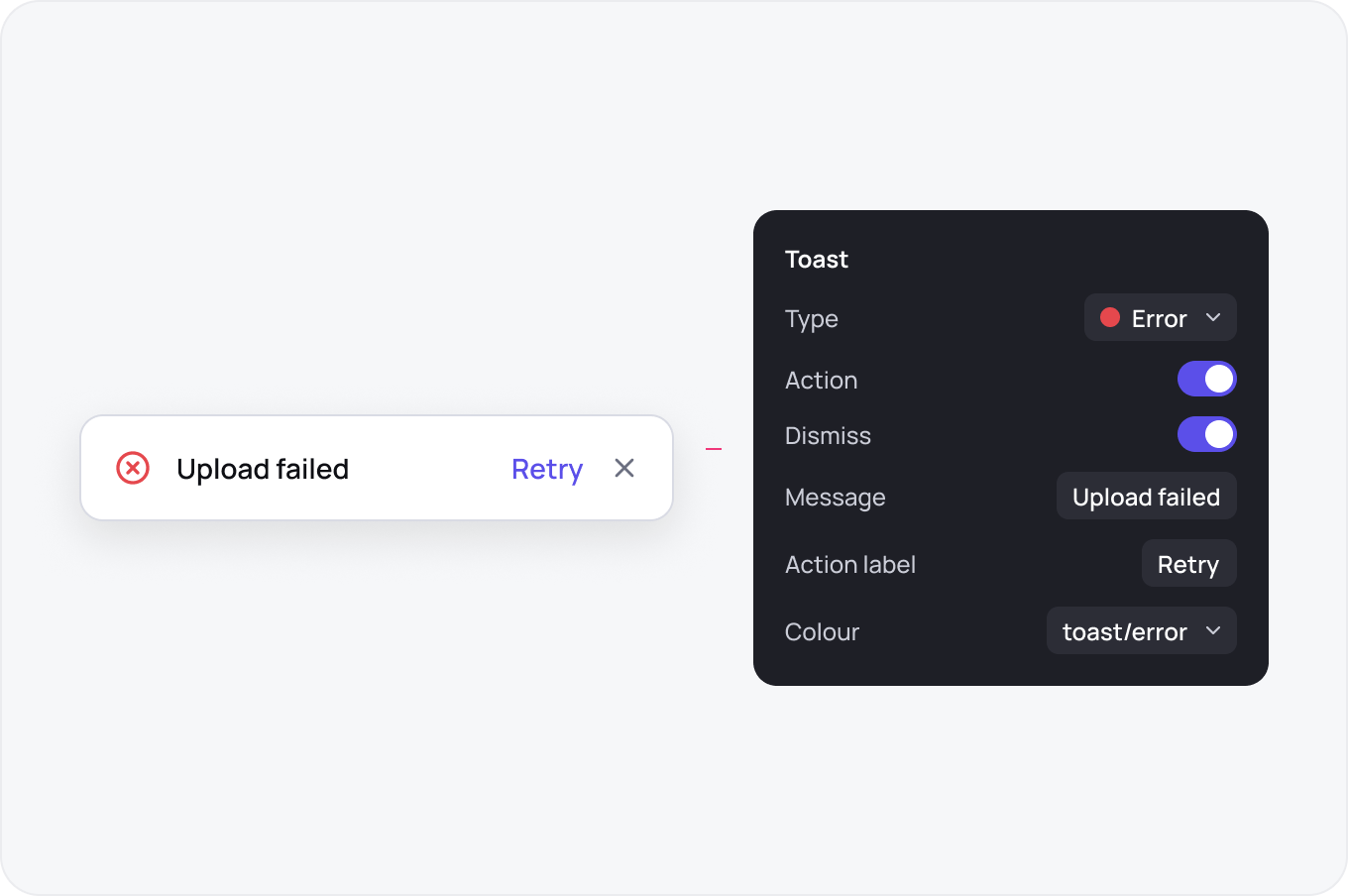
Variants for type, booleans for action and dismiss, a text property for the message and a colour variable per type so a rebrand is one change.